
Futureproofing Brand Identity
BRAND IDENTITY DESIGN. IT'S ONE OF THE SIMPLEST FORMS OF BRAND EXPRESSION. IT'S ALSO ONE OF THE TOUGHEST PROBLEMS IN DESIGN. AND THE PLAYING FIELD KEEPS CHANGING.
For decades, the brand logo was treated like a crown jewel, guarded more rigidly than any other touchpoint. Everything, from its colour and negative space to its size constraints and approved applications, was rigorously defended by designers who defined every do and don't to maintain maximum control over how the logo appeared in the world. Brand guidelines were, above all, instruments of protection. The underlying assumption was simple: consistency equals control, and control equals equity. In two decades of brand design work, the phrase I heard most often was "Don't touch the logo." I had also been part of a brand stewardship group that governed the global use of a brand identity.
Then the digital age arrived. And that assumption started to crack.
FROM PRINT TO PIXELS: THE FIRST DISRUPTION
The shift from print to digital didn't just change where a logo appeared. It changed the fundamental conditions under which a brand was experienced. Brands were no longer displayed in controlled environments — they appeared across websites, apps, social feeds, smart watches, video platforms, dark mode interfaces, and countless screen sizes designers could never fully predict. Screen resolution, device type, ambient lighting, browser rendering, operating system preferences: a brand's appearance was no longer in the hands of the designer. It was in the hands of the viewer's device.
That created an entirely new set of challenges, most of which the industry responded to through responsive design. High-contrast colour palettes, decisive typographic choices, stress-testing across screen sizes, optimised favicon versions, simplified app icons, accessibility guidelines in social platforms — these became standard practice. The more progressive brands went further, developing distinct logo variations engineered for specific contexts: a full horizontal lockup for desktop, a condensed vertical version for mobile, a reduced mark for the app icon, a single letterform for the smart watch face.
The underlying logic was sound. A brand that looked authoritative on a billboard but illegible on a 44-pixel icon had a problem that no brand guideline could paper over. Flexibility became a design requirement, not an aesthetic preference.
But responsive design, as important as it was, only addressed the rendering problem. It asked: how do we make this identity work across more surfaces? The more disruptive question — the one that a new generation of designers and brand thinkers had begun asking — was fundamentally different. It asked: what if the identity itself was never meant to be fixed in the first place?
THE LIVING IDENTITY: FROM COMPLIANCE TO CREATIVE SYSTEM
The "don't touch the logo" orthodoxy has been quietly dismantled over the past two decades, not by reckless brand managers, but by some of the most rigorous and celebrated design work of the era.
The argument against a fixed logo was never about inconsistency. It was about what consistency actually means when a brand operates across dozens of contexts, audiences, and media simultaneously. A single static mark, however beautifully designed, cannot carry the expressive weight of a brand that lives across social platforms, packaging, architectural signage, motion content, interactive digital experiences, and physical environments. Protecting a logo as though it were a precious object to be displayed unchanged is, in many ways, a category error — confusing the symbol for the thing it's meant to represent.
When MIT Media Lab needed a new identity, designers built a custom algorithmic system from three intersecting squares that could generate over 40,000 distinct logo shapes across 12 colour combinations — an estimated 25 years' worth of unique, personalized outputs. Each member of the Lab received not just a unique logo, but the source code that enabled its reproduction. The identity wasn't a mark. It was a system — one whose diversity of output was itself an expression of the institution's values. MIT Media Lab Identity System
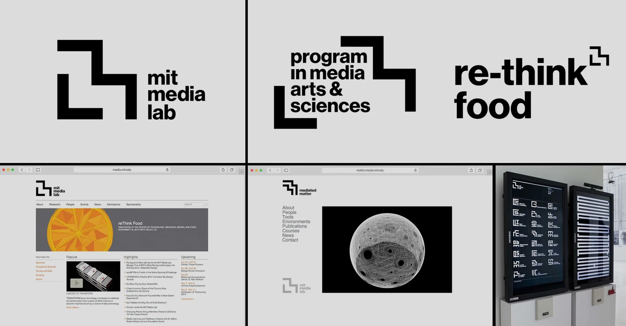
Images courtesy of MIT Media Lab
Around the same time, Mastercard was rethinking its own identity along different lines but toward the same conclusion. In 2019, the company dropped the "Mastercard" wordmark from its logo, declaring it could stand on its own. That same year, they introduced a comprehensive sonic identity — what CMO Raja Rajamannar described not as a jingle, but as a "flexible sonic identity" designed to adapt across situations and contexts. That system has since been deployed across more than 300 million payment points globally, becoming the brand's primary handshake in environments where the visual identity couldn't follow. Research suggests a sonic logo can boost brand recall in broadcast advertising by nearly 40%. In a screenless context, the impact is more dramatic — the difference between being recognized and being invisible entirely. Mastercard Sonic Branding
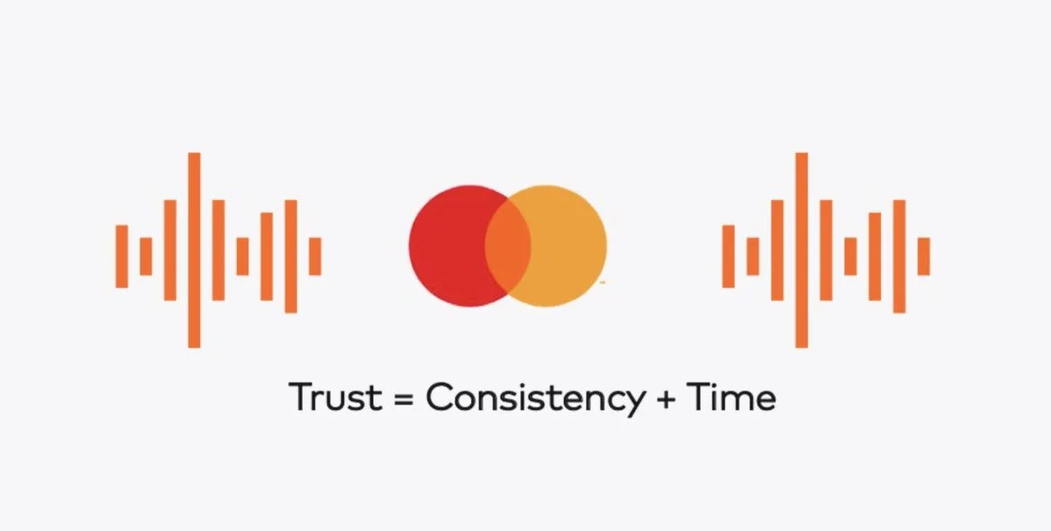
Image courtesy of Mastercard Developers
What both examples share is a fundamental reframing of what a brand identity system is for. The old model treated guidelines as a fence — the purpose was to keep the logo safe from misuse. The new model treats guidelines as a generative framework — the purpose is to produce consistent brand expressions across an almost unlimited range of contexts, without requiring human approval for each one. The designer's role shifts from gatekeeper to architect.
Today, brands across categories are developing what are sometimes called "living" identity systems: built around immutable structural principles — a core shape, a colour logic, a typographic system — that allow virtually unlimited surface-level variation. The logo is no longer a precious object to be replicated with fidelity. It is a DNA sequence from which an entire visual language is grown.
The practical implications are significant. Interactive identities invite audiences in rather than holding them at a distance. When users can influence how a brand appears — through preference, context, or behaviour — the relationship shifts. It becomes participatory rather than broadcast. That is a different kind of equity than the kind built through consistent repetition of a fixed mark, and there is a reasonable argument that it is more durable.
THE AI ERA: WHEN THE LOGO ISN'T EVEN IN THE ROOM
Responsive design addressed visual rendering. Living identity systems addressed expressive range. The AI era introduces a challenge neither of those frameworks was built for: what happens to brand identity when there is no visual surface at all?
Voice assistants, smart speakers, wearables, in-car interfaces, AI agents — these are environments where a logo, a typeface, and a colour palette are simply irrelevant. The brand either communicates through sound, language, and behaviour, or it doesn't communicate at all. This is not a hypothetical future state. It is the current operating reality for a growing share of consumer interactions, and it is accelerating.
The generative AI layer adds further complexity. Increasingly, consumers encounter brands not through the brand's own channels but through AI-generated content: summaries, recommendations, comparisons, and conversations mediated by large language models. What the AI reaches for — consciously or not — is the textual and tonal residue of the brand: how it has historically communicated, what language it uses, what positions it takes, what it consistently sounds like across years of public-facing output. Brand voice, which many organisations have treated as a secondary deliverable — something written into a guidelines document and rarely enforced — becomes a primary identity asset. It may be the only identity asset that travels.
There is a real risk here worth naming. Spotify's 2024 Wrapped, a feature that had previously felt personally curated, turned into a disappointment for many users. Reports pointed to a heavier reliance on automated systems, which missed the nuances that make music taste feel personal. That is what happens when the generative power of AI is deployed without sufficient regard for the brand's underlying human logic. The output scaled. The distinctiveness didn't.
WHAT FUTURE-PROOFING ACTUALLY LOOKS LIKE
The question of whether a brand is "future-proof" used to be, more or less, a question about the logo's scalability. Could it work small? Could it work in black and white? Did it hold up at low resolution?
Those questions are still worth asking. But they represent the minimum. Future-proofing a brand identity today requires thinking across a much wider set of dimensions.
Does the identity function as a system rather than a mark? The brands that have navigated the shift from print to digital to the AI era with the least disruption are those whose identities were always built around principles rather than a single fixed asset. When the principles are clear, new contexts can be addressed without reinventing the brand.
Does the brand have a sonic presence that is ownable and intentional? Not a jingle — a genuine sonic DNA that can travel into screenless environments and remain recognizable. This is no longer advanced practice. It is catching up.
Does the brand have a voice — a genuinely distinctive way of using language — that is consistent and specific enough to survive AI mediation? If a brand's written voice sounds like every other brand in its category, it will be indistinguishable in any environment where text is the primary signal.
And does the organization have the conviction to let the identity be interactive? The instinct to protect a logo is understandable. But a brand that treats flexibility as a threat rather than a design problem will find itself increasingly out of step with the environments in which its audience actually lives.
The brands building for the next decade are not asking how to protect their visual assets. They are asking how to build identity systems expressive enough to work in contexts they cannot yet fully anticipate. That is a design problem. But more fundamentally, it is a strategic one.