
Hershey’s Pot of Gold: Brand Refresh & Packaging Redesign – Canada & USA
Background:
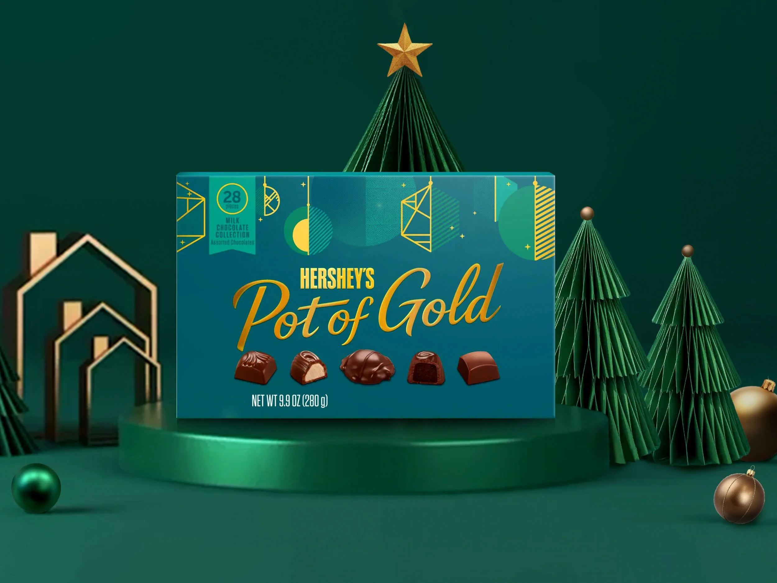
Hershey’s Pot of Gold has long been a holiday staple. It’s a familiar gesture of sweetness, often exchanged out of habit. Our challenge was to shift this legacy brand from a routine purchase to a more intentional and heartfelt expression of appreciation. We wanted to position Pot of Gold as a gift that carries emotional weight—a simple, affordable luxury that brings people closer together, whether shared with loved ones or enjoyed solo.
Scope & Impact:
We led the redesign of the packaging system for both the U.S. and Canadian markets, ensuring consistency across North America while tailoring specific elements to meet local retail requirements. The design elevated the product’s perceived quality with richer visuals, more premium finishes, and a clearer gifting proposition—while still preserving the brand’s mainstream appeal.
We also worked to align the visual identity with deeper emotional drivers: showing care, building relationships, and celebrating moments, big or small.
The refreshed Pot of Gold felt relevant for a new generation of gift-givers, re-establishing the brand’s place not just as a seasonal treat, but as a meaningful gesture.
CLIENT: The Hershey Company
AGENCY: Pigeon Brands